THE ART OF POLITICAL LOGOS
Whether it’s the Superbowl, World Cup or World Series, sports fans never have to wonder who’s who on the field. Not with their team’s colors and carefully crafted logo plastered all over the stadium. But the big game isn’t the only place where logos are visually dominant. In politics, campaign logos are one of the most recognizable visuals of an election bid, second only to photographs of the candidate. “Ultimately, a logo’s job is to build remembrance,” designer Sky Hartman told CNN in 2015. “If you can design a concept that sticks in people’s minds, you’ve been successful.” Political logos, though, have only really emerged as major visual campaign tools in recent decades.Most candidates nowadays typically tap the skills of high-end design firms, hoping the branding magic that have helped make MasterCard and McDonald’s instantly recognizable will rub off on them as well. The result is usually a red-white-and-blue version of a candidate's name -- or more likely one of their initials -- that tries to establish a recognizable brand by packing the essence of their candidacy in a succinct visual statement.

Logo Design 101
Because a logo is a single image with just a few design elements, every artistic choice counts. Mark Winn, a Bay Area painter and designer, starts his logo design process with a written list of characteristics that he’s trying to capture. He then begins experimenting with multiple versions of a single image. Like Winn’s personal logos, most political logos draw from a menu of colors, typefaces and graphic flourishes to convey something distinctive about a candidate or campaign message. With such a small canvas to work with, the slightest adjustment can pack a visual punch or even define the conversation.

In his 2016 presidential bid, Sen. Rand Paul (R-KY) used a logo that was praised for its italic slant, meant to evoke action and momentum (although not enough to win him the nomination).

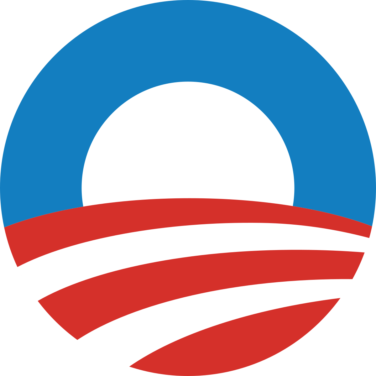
In 2008, then-presidential candidate Barack Obama’s logo took his last name, which sounded foreign to many Americans, and transformed it into a symbol reminiscent of a rising sun, a symbol intended to convey a message of hope and change.
The Critics
Given the amount of thought that goes into modern political logos, it’s no surprise that they are often critiqued like artistic masterpieces, with observers weighing in on every last curve of a letter or use of punctuation. During the 2016 primary season, major news outlets, including The Washington Post, Bloomberg and CNN, featured design experts who painstakingly analyzed each candidate’s logo. Even late-night TV hosts Jimmy Fallon and Stephen Colbert joined in, poking fun at the exclamation point at the end of Republican presidential candidate Jeb Bush’s logo. (Eventually, even Bush himself cracked jokes at his logo’s expense).
But jibes about punctuation are mild compared to the reaction to the first iteration of the Trump-Pence campaign logo unveiled in August 2016. The interlocking of the T in Trump and P in Pence caused a flurry of commentary, off-color jokes and artistic scorn. The flap blew over only when a second, very different image replaced the first, a notable switch given how rarely campaigns switch logos once they've gone they’ve gone public. The final logo. The second draft. (Wikipedia) Hillary Clinton’s 2016 logo was also widely panned for its right-pointing arrow and “FedEx feel." Despite the criticisms, though, the logo endured. “(A logo) is only one tool and it’s not more than a means to an end,” Michael Bierut, who designed Hillary Clinton’s 2016 logo told Wired magazine in 2016. “People don’t vote for logos. They vote for candidates.”
“Because a logo is a single image with just a few design elements, every artistic choice counts.”